After doing Moss Creek #1 for the Print Exchange, I sought to add cows by the water. Here are the June pencil sketches in my notebook. Some have black marker added. Double click on image to see it larger.

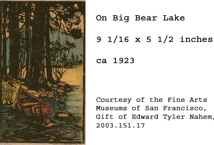
 My pencil notes on June 2nd reminded me: Use colors similiar to ones used by Frances Gearhart "On Big Bear Lake"
 Here are colors I thought I would use:
black-yellow (green) block
black-white (mid grey) block
yellow-white block
black-white-yellow (olive) block
Here are colors I thought I would use:
black-yellow (green) block
black-white (mid grey) block
yellow-white block
black-white-yellow (olive) block

When I had time to daydream about the design I changed my mind. Perhaps I would use these colors instead: yellow----lt.olive (lit trees)---red brown (pond)---dk green (trees)---lt blue base
Pencil drawings of plants in my neighbor's field gave me plant forms to cut on the linoleum blocks.

I thought I could mix greens using yellow and black, like the days I did when I did the Carrollton mural. But when I mixed both Speedball yellow with black I was disappointed. It produced gray-yellows. The yellow was not as pure as I had hoped. Instead it had a lot of white mixed in to it.
 A fellow print
maker gave me an idea. I made thumb-nail smudges of color in a scrapbook, starting with a base Speedball color and adding certain acrylic colors to it. For instance, a yellow Speedball base and an acrylic cerulean blue hue. I took the time, experimented mixing colors, and came up with the charts below. This gave me a ballpark of colors to work from.
A fellow print
maker gave me an idea. I made thumb-nail smudges of color in a scrapbook, starting with a base Speedball color and adding certain acrylic colors to it. For instance, a yellow Speedball base and an acrylic cerulean blue hue. I took the time, experimented mixing colors, and came up with the charts below. This gave me a ballpark of colors to work from.
In June I finished cutting all the linoleum blocks in the five-block set. Based on my notes I mixed ink and made trial proofs of the linocut (below).


Here are samples of the colors I mixed from that batch. Not all the blocks lined up like I wanted them to. In July I used ink to make new color schemes (below). I smeared ink on paper. Then, over the course of a couple weeks, I looked at them, thinking, thinking, thinking. At last I picked out the colors I wanted to mix for Afternoon Shade.
 This was the scheme I chose. Next I would mix these colors on my brayer palette.
In August I inked and hand-pulled nine individual prints from the five blocks.They would be trial proofs. The nine did not turn out "alike enough" to be an edition.

The green block was inked.
Click on video to see green block printed.
This was what the four colors looked like.
Click on video. Each inked block was washed off in the sink after I was done printing all the prints I was doing for that day. The green block was scrubbed with a brush and tap water. That was what I liked about water soluble ink:)
To make this top color I mixed my blue base with a white base and a dab of Raw Umber acrylic paint from the tube.
Click on video to see ink mixed on brayer palette.

This was the last and top block to be printed on all nine sheets.
Compare the cut design with pencil drawings above.
Can you see which plant patterns I cut out?
Can you see the cow?
How many cows were in the original design?
Of the nine hand-pulled prints two were selected for my woodcut show at the Lincoln Burkholder Project Gallery. The set of nine was not really an edition.They are not all the same, and so I think of them as monoprints, or one-of-a-kind.
Double click on image to see larger. I love the lighter colors.
Afternoon Shade measures 4 by 6 inches. It is a color linocut. It is printed on 75 gsm eucalyptus bond paper. It is in a white mat.