Saturday, March 26, 2011

JUMP IN - TRY

Earlier this month I was thinking about the color woodcuts of Frances Gearhart

Double click on images to see enlarged. Just finishing another beveled plywood woodcut (above) with water reflections in the foreground, a shaded bank in the middle, and some foliage over that. Wondering how a solid color could be added behind that image and what that might look like.

Woodblock artist Ansei Uchima described the way he made sure one print was carefully lined up on top of another. His solution was to secure his woodcut block to a printing board "with nails flush against the bottom edge and the corner of the block." There was more to his method, but it dawned on me that printing a second impression on top of the first one would take some thinking and lots of trying. 

This particular post is about not having all your facts together. Sometimes you have to jump into it, and try something, follow your hunch, do it, not know everything, just "try it out." 

The hunch that came to me was to ink the blank side of the plywood plate and print that on several separate sheets of paper. Then, after those were dry, possibly ink the top woodcut, line it up, and print it on top of the solid color background.

One day I had the right kind of energy to do some inking. I set out my long boards for the prints to dry on. I had typing paper to practice on. Some nice brown Kraft paper and some American Masters 90 lb printmaking paper from Utrecht. At the beginning, I drew an outline of the woodcut block on my printing board. I centered a sheet of typing paper on the uninked block, and drew an outline of that sheet on my printing board. Both of these marks served as guides for lining up my prints. One of my goals was to line up prints BY USING MY EYES AND MY HANDS.


This is what a print can look like when the plates do not line up.

Click on the right hand X on the Google ad (when it appears) and it will disappear. This six minute video shows inking solid blocks of color. I am mixing water soluble white acrylic tube paint with water soluble black Speedball ink. You will see the pattern that the burnisher makes on the print when I pull it up. To get an even print one must apply even pressure all over the back on the print. The first print usually has no color, not enough ink reaches the paper, or the ink is not the right consistency. The more I used the Speedball ink, the richer the print looked to me. 

 Here is one try at a solid color block.

 
Another try on Kraft paper. Notice the uneveness of the ink, where I did not burnish the back of the paper. Some print makers might like that particular effect. I was trying for a solid color.

Click on the right hand X on the Google ad (when it appears) and it will disappear. This three minute video continues the process. I am trying to line up a dry print in my hands with a second impression on wet ink. Technically two colors. You notice I am mixing ink as I go. I did not analyze the results until the ink had dried. Merely spreading out prints to dry overnight, and gathering them up the next day. Figuring each step out takes a certain kind of energy. Work at your own pace.

 
An example of two color print or one print on top of another. Double click on image to see color variations.

This is two passes of blue and one upper pass of green. Three impressions in all. Top image was printed on Kraft paper. Bottom image was printed on typing paper. The green swatch would make the top of the water reflection image look more like foliage. In the end it did. So this was a good calculation.

              
Click on the right hand X on the Google ad (when it appears) and it will disappear. This six minute video has me building up the consistency of the ink for the water reflection woodcut. You can see the first "impression" or print is garbled. I am trying to ink it a little bit more each time. The person rolling on the ink controls the amount of ink on the plate.

Notice the little dots on this impression. The paper was not even burnished on the back.  

The same impression was printed twice.

The same impression was printed twice. Blue ink the first pass, black ink the second pass.

                 
Click on the right hand X on the Google ad (when it appears) and it will disappear. In the Block Color 4 video I am ready to print the reflection woodcut on top of colored background.

 One attempt. 
Are the blocks lined up right?

Another attempt.

Another attempt.

                     
Click on the right hand X on the Google ad (when it appears) and it will disappear. One minute video.
Below are Glidden Road and Quarters prints on top of various solid color blocks. 


In the "trying and attempts" there is experimentation, and you find out if your hunches were right or not. Some of the images above are slightly tipped, well, yeh. But I discovered that prints that were created toward the "end of my trying" looked the best. So, lining up prints with EYES AND HANDS can work.

A week later I examined my sixty four dry prints. There were not enough prints that looked so much alike that they could be part of an "edition." Just to illustrate this point take a look at the two prints (above). Double click on images to see the detail. An edition of numbered prints can not and should not have this much difference between the prints. As I am still learning about inking, burnishing, printing...rather than "fidget over what I have printed so far".......I have decided to move on.


Now I am putting ideas down on paper (above) and using a black marker where the darks should be. My interest lies where light regions turn into dark ones. A better place to work out the design is on paper. It is time to put some thought into my next piece.

Wednesday, February 9, 2011

woodcut with beveled plywood plate

This woodcut exhibit is amazing. After finishing this extensive post I was itchy to try a woodcut myself. Claire Leighton used dark silhouettes in her designs. See Under The Greenwood Tree (below). Double click on images to enlarge. 

Helen West Heller loved pattern in her work. 
See Flight Arrow (below)


In the dim morning light I sketched my black dog stretched out on the sofa. In homage to both Leighton and Heller I put in dark silhouettes and patterns. Drawn lightly with pencil, then over with Sharpie marker. Close ups (above). Digging with the lino cutter was much harder on the plywood plate. It was aggravating. Was I wasting my time?? Plate before inking (next). Turquoise inked plywood plate (next).


Quarters I, 5 by 7 inches, beveled plywood panel, turquoise inked image above. 


Click on inking of Quarters I print 2 minute video.

After experimenting with acrylic paint from the tube and then with the Speedball water soluable ink, I decided the acrylic paint printed too light. The commercial Speedball ink had a better tack to it. Rolled out on the glass pane, it had a better consistency--it laid down thicker and the print was more even.


5 minute video, talking about plywood plates.

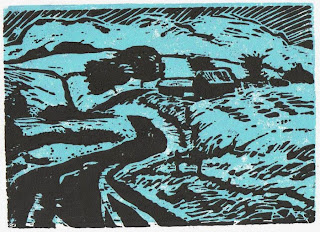
Glidden Road was done different. I stained the plywood surface with watered down Raw Umber acrylic paint. Then, lightly drew pencil design on top, from a painting by the same name. Then, made cuts with my lino cutter. The flicked cuts showed up easier this way. The effect was clearer to see as I worked over the surface. This time I through myself into the project. The only way to get better was to get busy and do it. Just do it. 
I was wanting to be good at it before I even knew what I was doing. That whole "beginner's attitude."


Glidden Road (Homage to Lankes),
5 by 7 inches, beveled plywood plate (above). Turquoise inked plate (next). Last impression (below that).


It was practical to roll out on the plywood plate, lay a clean sheet of paper on the inked image, rub the back off the paper, then pull the paper off, set it aside to dry on the rack. Then repeat the process again. Ink the plate, lay on the paper, rub the back, pull the paper off, and set aside to dry. Then do it all again for each print, until the paper was gone. One hopes the image will print the same each time.

I had cut the plates on Saturday. Then, Sunday after church, we drove by her art room on campus and I sprayed a clear coat of fixative over the plywood plate. (This fixative only works at 50 degrees or more, thus spraying indoors was the way to go, not out in the cold cold snow, no.) Let dry and sprayed another coat. When we returned after lunch, the plates smelled lacquery (of course) but they were water-proofed, ready to be inked. Then, when the inking was done for the day, the ink came off easily with a scrub brush and tap water in the sink, and the moisture was toweled off the plates.

A set of three images are taped to my wall, where I can glance, and let that "new beginning" grow on me. I have bought more plates and want to do it some more. Here is to "new beginnings."

Monday, January 10, 2011

linoleum cutting

 
With tools purchased some months ago, a "snow day" at the beginning of the work week, an eraser, the back of a cradled support, jazzy music, warm stocking feet, and hot cocoa....I try my hand at a lino cut.

One minute video of cutting setup. Click on the X of the Google ad when it appears, and the ad will disappear. The 3.75 by 4.75 inch linoleum rectangle is secured to the back of a cradled support with tape. The support rested on a rubber eraser, which enables the support swivel and rotate as needed. Double click on images to see larger.
Pencil drawing on lino pad based on ABOVE photo. Next, went over the pencil drawing with thin Sharpie marker.
Cutter tip loaded into the cutter handle after loosening the chuck. Followed directions: After securing the blade in the handle, position your forefinger as close as possible to the cutting edge. As a safety precaution while cutting the block, position the hand holding the block behind the hand holding the tool. Apply even pressure, and ease off when completing the cut, It is not necessary to dig deeply into the block.
                 
Eight minute video. Click on the X of the Google ad when it appears, and the ad will disappear.


Click on 3 minute video tiny cuts.
 The inking portion did not seem so exciting to me. Not able to find a glass pane I improvised with aluminum foil.
 
click here for 5 minute video inking lino pad. Decided to roll water soluble acrylic paint out with brayer on aluminum foil.
Turquoise Speedball water soluble ink printed on dry typing paper.
Here is same print on black paper.

Used bristle scrub brush, soap, and water to vigorously wash off ink on lino pad.
After drying with clean cloth, the linopad want to warp -- so I sandwich the pad between two layers of paper towels on the table. Then I pile a couple heavy books on top and leave it to dry overnight. In the morning the pad is dry and flat.

I am exactly like anyone else who has not tried a new medium before. I do not know what my efforts are going to look like. I see the results and immediately hate what I see and want to throw it away. Inspite of my feelings my wife tells me it looks good. Well.... I must follow the same advice I hand out to any beginner. "Put the artwork aside, sneak looks at it from time to time, and let it grow on you." I will tell you this much--I enjoyed cutting it more than printing it. I want to try another one. And I certainly have gained a better understanding of the process myself. Now when I look at a linocut by another, I know more of the work that went into a piece.
Route E Snow, linoleum pad, 4 by 6 inches (above) Last impression (below)
After looking at the print over a couple weeks, I went back in and cleaned up the image. I like it better now.

Saturday, January 8, 2011

organic and abstract

The 23rd Annual Artists Choosing Artists Exhibit features artwork this month by Burkholder Project member artists and their guests in a variety of mediums. The artist I chose for this exhibit is my wife of 28 years. Her work (below) is beside two of my paintings. The exhibit runs January 4 - 29, 2011. The gallery is located at 719 "P" Street in Lincoln, Nebraska.
Before I met Jan Nelson Marxhausen, she was a diversified artist. She boldly created wood sculpture and clay figurines. In her oil painting RED SKY (above), she experimented with abstract and organic forms. That took guts. Double click on image to see it larger These days she works with over one hundred students. She teaches kindergarten through sixth grade ART at Carrollton, Missouri. Her artistic gusto continues to amaze me. Below are a couple examples of her sculpture that are not in the show.

"This is called Spring Chick. It was made from metal parts I found at a junkyard in Seward, Nebraska. The body was a rusted air duct. The beak was made from two plow pieces. The wings were two car visors. It had a long curved metal tail. The eyes were made from rear view mirrors on a Jeep, I think. I welded it together in class. I can't remember if it was arc or acetylene. We learned how to do both. My sculpture instructor was Don Dynneson. We had class at the Art Annex. It was a house the art department used, across the street from the administration building. Concordia used to be a teachers college, but now it is a university."
"This figure is called Joy. It was another assignment our teacher gave us. Dynneson had some log chunks to pick from. They were probably walnut. The first thing he had us do was make a "mock-up thing out of wax." That gave him an idea of what we wanted to make. It was part of the process. With a chainsaw, the bigger chunks were removed. I used wood chisels and a mallet (made out of a wooden bowling pin) for the finer cuts. A power sander was used with different grades of sand paper to make the rough areas smooth. The work was rubbed it down with linseed oil. A layer of furniture wax or floor wax was used for the final coat. It was made out of ONE piece of wood."
Photo of artist, Jan Marxhausen (above).
For examples of sculpture by her former professor, click HERE and HERE and HERE.

(Interview with artist Jan Marxhausen January 8, 2011. Painting and sculptures courtesy of private collection by artist. Professor Dynneson sculpture links, courtesy of City of Olathe, Kansas, http://www.olatheks.org/GIS/SculptureMap/ods_07_catch,
http://www.olatheks.org/GIS/SculptureMap/ods_07_firebird, http://www.olatheks.org/GIS/PermanentSculptureMap/pos_ferro, May 21, 2007 post http://www.shareandenjoyblog.net/2007/05/21/what-a-bird#more-284 accessed January 8, 2010.)

Thursday, December 30, 2010

follow the process

One of the things I loved about ceramics in college was the sensation of muddy slip and texture of grog, clay which has been fired then ground up, sitting in an encrusted bucket of liquid grit, oh yeah!!
 
 (above and below) Here are close-ups of a 1978 "floor piece," from my senior year at the University of Nebraska-Lincoln. I had my own 10 by 10 foot studio space on the second floor of Richards Hall. The 24 by 36 inch paper was taped to the floor, and I was dropping bits of texture right into the paint. Look closely and you will see sunflower seed shells. A "whole-other-wonderful" strategy was in place to savor and excite.
 
That "strategy" or "process" was about being physically engaged, reaching over, mindful of the taped edges, precarious steps across the image, looking down, hurling liquid color, drinking in silence that surrounds me, the intermittent cooing of birds from the eaves of Richards Hall outside my window, the sharpness of the temperature in the room, the charged excitement I felt within this Nebraska winter, immersed in the piano and vocals of Billy Joel from my Radio Shack cassette player. Independent, wide open and moving about in my studio space.  The swirl of it all, focused, creating, doing, moving, being intentional, occasionally stopping to assess what the image looked like. An entirely different mindset from "landscape painting." Enriched, hands-on, visceral.

       This morning, sponge in hand, my eyes creep over gridded particles, taking in the general appearance, and hand dabbing liquid pigment on raised grit, my eardrums awash with the jazz music of Spyro Gyra (above). That same "process" is taking place here twenty-two years later. A large heavy support is centered on a stool and rotated as I sponge. There is a balancing act, muscles wrestling the support, and an awareness of my studio space. The underlying grid, made earlier in the gel medium, resurfaces. Selective sponging the grit is key. 


In this video you can see the "intention" for yourself. I am watching as I dab. Surely my father worked in a similiar manner, that is, experimenting with materials, and expecting to be surprised by something new. Working from a calculated hunch. Setting the work aside. Coming back, drinking the image in, being open minded. Assessing "which results" I like, entertaining what to do next, moving forward with the next hunch.