Showing posts with label relief printing. Show all posts

Sunday, January 15, 2012

making masa ready


My paper order arrived from New York City. The masa came in standard sheets measuring 21 by 31 inches. (above) For my next project I require sizes 12 by 10 inches and 18 by 15 inches. Steel ruler in hand I measured each sheet, made pencil marks, and tore the sheets to the needed sizes. The uneven torn edge is important to that project. Click on 3 minute video.

Masa is a white paper, made by machine out of 100% sulphite. Sulphite is a chemical wood-pulp obtained by cutting wood into small pieces and cooking it with calcium bisulphate or sodium sulphite to remove natural resins and break down the cellulose fibers. While sulphite does have a short fiber, it increases bulk, softness, and absorbency, which are important qualities for a variety of techniques.  Masa has a neutral pH. It is smooth on one side with a light texture on the other. It weighs 77 gsm. To give you an idea of its weight, tracing paper is 30 gsm, a standard bond eucalyptus paper used for typing is 75 gsm, and a heavy etching paper such as Rives or Arches is typically 250 gsm. When hand printing is used, lighter weight sheets are easier to burnish and transfer more ink from the plate or block. (courtesy of New York Central Fine Art Papers, 62 Third Avenue, New York, New York, www.nycentralartsupply.com, accessed January 19, 2012)


Next, comes adjustments to my registration guides.

Thursday, September 8, 2011

demo compares ink efforts with geary

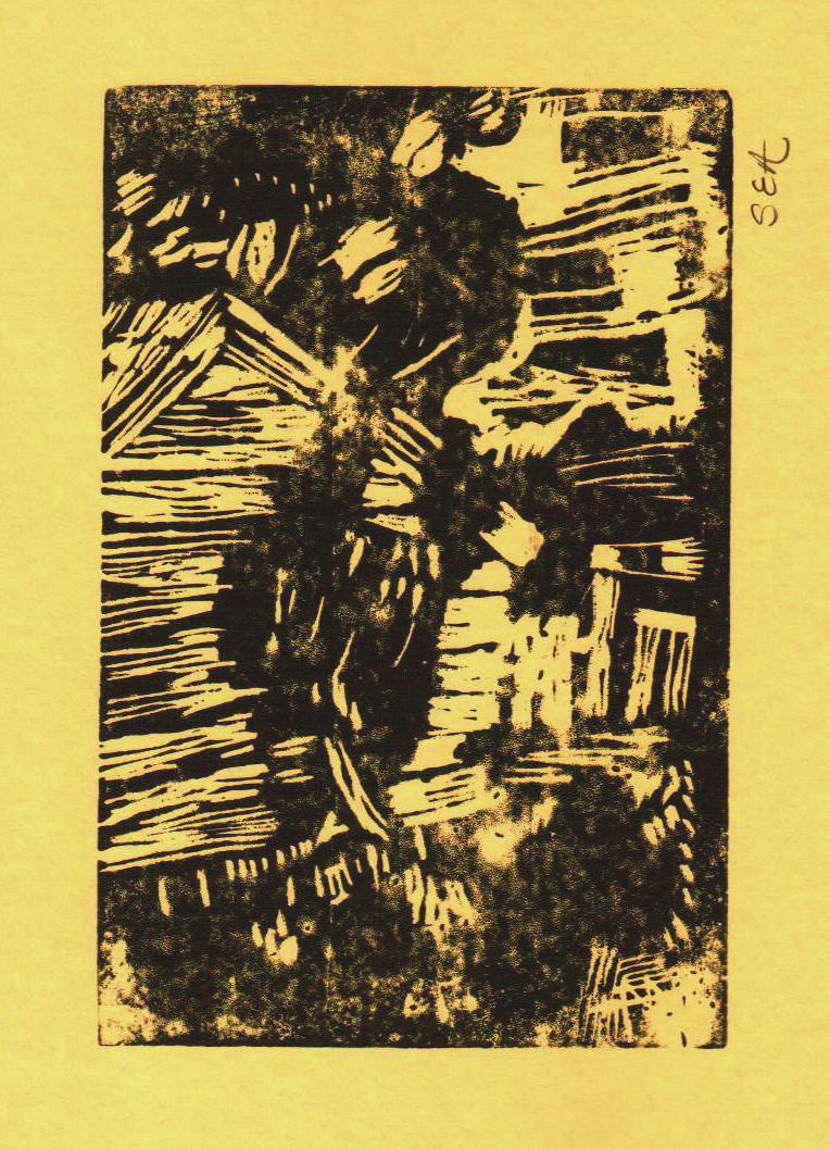
Sunday afternoon flecks of linoleum landed beside the bench hook. Diligent hands grasped the red-handled liner and made repeated dips through the taut golden skin. Eyes flitted between freshly pulled prints of others and their own as each hung side by side in the auditorium. Minds reflected on brayer ink, how it was rolled, how it was applied to the block. How the cut block was not like a rubber stamp that can be dipped into a tray of ink and dabbed on paper. It was not like the potato print one made in grade school. The carved linoleum block was something else. One person concluded she had too much ink on her block. Portions of her detail were covered up.

Double click on each original linocut inking (below) and compare with closeup of Fred Geary wood engraving.


Sue Autry of Norborne
Fred Geary of Carrollton
Lorraine Denny of Seward


Karen Firnhaber of Seward


Anna Autry of Norborne


Two minute video. Linoleum block cuts, comparing inked prints, centering ink on cardstock paper at Civic Auditorium, Seward, Nebraska

(Geary images courtesy of Carrollton Public Library, 1 North Folger, Carrollton, Missouri)

Tuesday, August 9, 2011

afternoon shade linocut

After doing Moss Creek #1 for the Print Exchange, I sought to add cows by the water. Here are the June pencil sketches in my notebook. Some have black marker added.   Double click on image to see it larger.                      


My pencil notes on June 2nd reminded me: Use colors similiar to ones used by Frances Gearhart "On Big Bear Lake"


Here are colors I thought I would use:
black-yellow (green) block
black-white (mid grey) block
yellow-white block
black-white-yellow (olive) block


When I had time to daydream about the design I changed my mind. Perhaps I would use these colors instead: yellow----lt.olive (lit trees)---red brown (pond)---dk green (trees)---lt blue base


Pencil drawings of plants in my neighbor's field gave me plant forms to cut on the linoleum blocks.


I thought I could mix greens using yellow and black, like the days I did when I did the Carrollton mural. But when I mixed both Speedball yellow with black I was disappointed. It produced gray-yellows. The yellow was not as pure as I had hoped. Instead it had a lot of white mixed in to it.


A fellow print
maker gave me an idea. I made thumb-nail smudges of color in a scrapbook, starting with a base Speedball color and adding certain acrylic colors to it. For instance, a yellow Speedball base and an acrylic cerulean blue hue. I took the time, experimented mixing colors, and came up with the charts below. This gave me a ballpark of colors to work from.


In June I finished cutting all the linoleum blocks in the five-block set. Based on my notes I mixed ink and made trial proofs of the linocut (below).


Here are samples of the colors I mixed from that batch. Not all the blocks lined up like I wanted them to.
In July I used ink to make new color schemes (below). I smeared ink on paper. Then, over the course of a couple weeks, I looked at them, thinking, thinking, thinking. At last I picked out the colors I wanted to mix for Afternoon Shade.


This was the scheme I chose. Next I would mix these colors on my brayer palette.


In August I inked and hand-pulled nine individual prints from the five blocks.They would be trial proofs. The nine did not turn out "alike enough" to be an edition.


For alignment purposes the orange block was pushed up from the baseline. (see next photo)

Each time after I inked the yellow portion of the block I placed a paper cutout over it.


The yellow portion and the orange portion were cut on the same block.

They were inked separately. 

The block was washed off after a color was finished being used.


After inking the blue block, a paper cutout mask was placed over it before making a print from it.
 

Click video to see blue block printed. 
Here is what the block print looked like after that. There are nine prints made like this. Some aligned better than others. This was how I find out how to lay the blocks out on the registration board. Through trial and error.

The green block was inked.
 

Click on video to see green block printed.

This was what the four colors looked like.
 

Click on video. Each inked block was washed off in the sink after I was done printing all the prints I was doing for that day. The green block was scrubbed with a brush and tap water. That was what I liked about water soluble ink:)

To make this top color I mixed my blue base with a white base and a dab of Raw Umber acrylic paint from the tube.


Click on video to see ink mixed on brayer palette.
This was the last and top block to be printed on all nine sheets. 

Compare the cut design with pencil drawings above. 

Can you see which plant patterns I cut out? 

Can you see the cow? 

How many cows were in the original design?

Of the nine hand-pulled prints two were selected for my woodcut show at the Lincoln Burkholder Project Gallery. The set of nine was not really an edition.They are not all the same, and so I think of them as monoprints, or one-of-a-kind.
Double click on image to see larger. I love the lighter colors. 

Afternoon Shade measures 4 by 6 inches. It is a color linocut. It is printed on 75 gsm eucalyptus bond paper. It is in a white mat.