Saturday, May 3, 2014

rendezvous with karl

PHOTOS BELOW. Chillicothe Business College mural, painted from a scissors-lift three stores up. The full space was 100 foot wide. Ten foot illustrations was course work offered at that turn-of-the-century school.

--- The Karl from 2014 is melding with the Karl from 1998 and the Karl from 1977. What a rendezvous. the VAST INTENSITY joy undivided is stitching my memories into one person. that PHAT PHISH. beautiful FIRE. my king and lord jesus. from a 1996 journal entry entreats me to: DELIGHT IN HIM, speak of him, SING TO HIM, let my tears be on display, be a model of tenderness, be open, be gentle. 


 --- I remember what Danielle Sullivan told me about the red plastic tear drop, with the bright glitter outline, in the middle of blue felt jesus hands. she said: "THAT US. WE ARE IN THE WOUNDS OF JESUS. THAT IS WHERE HE HEALS US." that nine year old observation, so fresh and real. 


Danielle gets autograph BELOW from reggae band Temple Yard, when they performed in 1999 at That Phat Phish Coffeehouse, 14 North Main, Carrollton, Missouri. Off the CD they handed out. Lion of Judah, and Tell Me, and Freedom In Captivity,  samples, listen.


 --- The night I woke up at two o'clock in the morning to record on paper what he pointed out to me from that night's movie at the Uptown Theater in Carrollton. As Bud of Pleasantville told the students in the soda shop about his experiences "outside Pleasantville," the blank book pages came to life. How the roads are not a circle path, but they go on and on. He declared an experience greater-than-you-have-ever-known with jesus and the wonderful drenching rain of the spirit and the beauty of jesus ( full text at http://karl.marxhausen.net/pleasantville.html


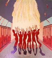
Carrollton sculptor Robert Willis ABOVE mounts his welded shovel bird at 1999 Beautiful Fire exhibit, 5 East Benton Street, Carrollton. That exhibit was sponsored by That Phat Phish coffeehouse, for a one-day event.


 --- it was my chat with wayne, something my youth group wrote on paper, the VAST INTENSITY JOY UNDIVIDED crashing mashing melding smoothing splashing into my mind and heart and being. he is ALL THAT..........and so much MORE. He stirs my senses in my 58 years old self. He embraces this porcupine, I am His and He is mine. 


PHOTO BELOW, a piano break of mine, in gymnasium. One stop of many during my father's art workshop tour 1970 - 1971, around the United States when I was age 16.


 PHOTO BELOW. at age 20, on my knees in the Commons room of Centennial College, surrounded by Jon Swift (upper left), Dan Swinarski (holding lamp), Tim Roper (center), Lynn Williams (upper right). my advertised happening event, tearing paper strips from discarded Lincoln phone books, tossing them up in the air, watching them flutter poetic to the floor. 1975 at the University Nebraska in Lincoln.


---- My piano self in 1977, sitting on the wooden bench of the Neihardt snack bar, next to Jon Swift, harmonizing about my neighbor Bob Popek in a warm and silly chorus. Conversing with the grown up version of Jeffrey Binder, the flute person who now is a neurologist in Wisconsin doing brain research. That friendship stretched through time and space into May of 2014. oh my lord, my phat phish, my delight, my king. you ARE so good.


Friday, May 2, 2014

floating line

Floating Line by Karl Marxhausen.
30 inches in length by 3/4 inch wide, 2014
DOUBLE CLICK ON IMAGE TO ENLARGE.

At my day job,
I created
the illusion
of a floating line.
Notice the door detail
BELOW.


Paper is taped to the door,
with a break, so the door can open
as it should.
I love this illusion
very much.
 

vertical color tab #4

This fourth one
has
shapes
either IN FRONT OF
or BACK BEHIND
the vertical line.
I enjoy
this creation
of space
and
depth. 

 Vertical Color Tab #4 by Karl Marxhausen,
12 inches tall by 5 inches wide, 2014


vertical color tab #3

Vertical Color Tab #3 by Karl Marxhausen,
100 inches tall by 4 inches wide, 2014.
double click on images to enlarge

This third one uses
the letter M for Marxhausen
and a pattern of
same color slashes.
Shapes
are either IN FRONT OF
or BACK BEHIND
the vertical line.
The PLACEMENT
of one color NOTE
and the next ONE
and
the next
BELOW that.


color
notes
to enjoy
from
top to
bottom.

vertical color tab #2

Vertical Color Tab #2 by Karl Marxhausen,
102 inches tall by 4 inches wide, 2014.
DOUBLE CLICK ON IMAGES TO ENLARGE

 This second one veers right
and curves to the left.
Diagonals
are either IN FRONT OF
or BACK BEHIND
the vertical line.
The PLACEMENT
of one color NOTE
and the next ONE
and
the next
BELOW that.

color
notes
to enjoy
from
top to
bottom.

vertical color tab #1

The students at my day job had been gluing colored construction paper to a shoe box to hold their Valentine cards from fellow classmates. I gathered up the scraps and began to make a vertical collage off one long long long long long long strip of construction paper that went up up up, almost to the ceiling. DOUBLE CLICK ON IMAGES TO ENLARGE.

Vertical Color Tab #1 by Karl Marxhausen,
105 inches tall x 3 inches wide, 2014

color
notes
to enjoy
from
top to
bottom.

Thursday, May 1, 2014

a.r. kretzman


Golden Embers, 1953, p.66

Reinhold Marxhausen said A.R. Kretzmann kept him alive spiritually and physically after he finished schooling at the Art Institute. He was living in a basement room and sometimes a meal at the Kretzmann's was it for the week. Before he headed to Seward to teach Kretzmann bought him a good set of clothes to teach in. The Correspondent, Aid Association for Lutherans, Vol. 70, No. 467, p.5, 1972
The other presenter was Dr. A .R. Kretzmann, who was my pastor in Chicago.  He designed the new church they built when I was away at college, and I suspect he also designed the Valpo chapel, since my church was just a smaller version.  I know he designed both of the church windows.   Amanda Husberg January 30, 2015

Yes, he was a multi-talented designer.  I knew he was involved in that chapel some way, his brother was O.P. Kretzmann, the president of Valpo.   A.R. designed our church, the windows, the altar, the pulpit and baptismal font, as well as skinny, tall stained glass windows in the narthex, when you first came into the church.  The Pulpit and baptismal font had big cloisonne shields on them, gorgeous! and he had special candle holders too.  In fact, the windows were so bright (in a geometric design, flaring out from dark to light) that they had to make little metal shields to fit behind the flames of the altar candles because you couldn't see if they were lit.  I took slides of the main windows and sent him the best one.  He sent me back a nice letter saying it was the best slide in their collection. In fact, he was such a historian too, there were little antique gems all around the chancel.  It was so busy you could hardly see anything.    Ah, the old days.  I don't know where they ever got the money to build such a church and they even had to build it about 12 ft. back from the sidewalk because there was always talk about the city widening the side road and taking property by "eminent domain" so they just did it a little narrower.  The church has clear story windows and the worst part was that the church was so high and narrow you couldn't hear people singing three pews behind you.  That was a disaster, but the organ was big and good and supported all the singing.       Amanda Husberg February 2, 2015
AR was the brother of OP Kretzmann, the Valparaiso University president (one of six or seven brothers, almost all of them LCMS pastors).  He was pastor of St. Luke's Lutheran on Belmont in Chicago for many years, was a liturgical consultant and involved in conversations about art and architecture and spoke frequently about art and architecture. I believe his records are still in boxes, uncatalogued, in the basement at St. Luke's, but I'm not sure. He was a big man in both personality and stature. Not well known as a designer himself, but well known in those circles.  You can ask Martin Marty about him, too.      Gretchen T. Buggeln, Christ College, Valparaiso University, May 11, 2015

Reinhold Marxhausen presented at Long Beach Southern California Lutheran Teachers Conference in 1960. A.R. Kretzmann presented also. (source material courtesy of Kim Violette)


What MORE SHOULD be said about A.R. Kretzmann?

koenig - art appreciation


Koenig invited students to his house once a year. There was art everywhere. He was a unique professor. Jack Duensing  January 12, 2015

I am thinking of Henry Koenig. He was at the college and I helped him move his paintings across campus.     
It was when I was in high school. He was moving artwork he had in his collection from his office to his house. He lived on Faculty Lane. He had so many pieces in his house. There was hardly a space left on the wall. (laughs)  David Held April 9, 2015
Silver Maples, 1950

He was an English teacher and he had a collection of prints or very good material. He brought those things out for us to see in his art appreciation class. Gerald F. Brommer Jan. 19, 2015

                           Koenig and his collection:

   Koenig's collection of things came to Concordia through his bequest, and his death was sometime after Marx arrived on campus. Only then did it require a caretaker, a job that probably just fell to Marx by default. Actually the term "curator" seems too formal for what he did at the time. 

    Marx and Koenig seem to have had a good relationship. Koenig was not an artist; he was a beloved Humanities professor at Concordia.  Koenig was not a sophisticated art collector. Koenig's eclectic collection—which by all accounts filled his house—consisted of many decorative glass, ceramic, metal objects from many sources (only a small number had much aesthetic or monetary value); many framed reproductions of all kinds of images (even some from magazines); a few oil paintings purchased at department stores; and a number of original lithographs and etchings published by the Associated American Artists in New York in the 30's, and maybe the 40's. Only the latter had and continue to have value, depending on who the artists were. Collection was stored in the gallery area in Weller basement.
    For many years the framed reproductions were rented for a nominal charge to faculty and community people on an annual basis. However, by far the real significance to the University is that it became the start of an important collection of original prints on paper that was developed over the years, mainly through grants and occasional donations...keeping the name the Koenig Collection. I took over responsibilities both for the exhibition program and for the Koenig Collection a year or two after I came to teach at Concordia in 1964 (in exchange for getting rid of having to teach "Children's Art" !)  I saw to it that the collection of original prints was properly cataloged, that all the original prints were correctly matted in archival acid free materials, and that the collection grew with the addition of works on paper by significant contemporary artists. These works are often displayed both in gallery exhibitions and elsewhere on campus today and the current collection has received some recognition in the state.
    Of course, the name of the gallery changed from the Koenig Gallery to the Marxhausen Gallery when its location shifted from Weller basement to the space in Jesse Hall.

    Jim Bockelman has been in charge of the gallery and the collection for some years now.  Dick Wiegman December 31, 2014