To "toss my hat into the ring" simply means I agreed to follow the rules for a recent print exchange. Here are some nuggets that helped me.
xxxxxx oooo xxxxxx
in April I got my closest look at the type of wood block plates that Fred Geary might have used. Those who follow my blogs know I have researched Geary's wood engravings. In this case, Herschel Logan had been a contemporary of Geary. Both had entries accepted by the Midwestern Artist Exhibitions of the Kansas City Art Institute. Both had been active members in the Prairie Print Maker group out of Kansas. One Saturday the Print Society bunch I was with made a road trip to the campus of Kansas State University, in Manhattan, Kansas. It was there at Beach Museum of Art that we were shown the Logan plates.
Click video to see the print group gathered to view Logan block plates. One and a half minutes long.
During the last half of this 2 minute video, Senior Curator Bill North told us that -- though Logan's prints were often cataloged as wood engravings (not having looked at the blocks at all), it is plain to see that Logan worked on the plank side of the board, not the end grain as most engravers do. When Logan wrote about his works he clearly referred to them as "woodcuts." North also explained that Logan worked from photographs for his compositions.
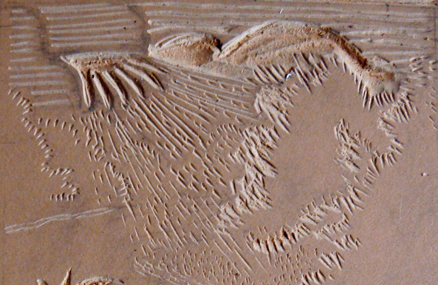
(Below are portions of Logan's Tornado print and what that portion looked like on the carved woodblock. For me, this is where the mystery lies. Relief printmakers "dig out" of wood to make these images.) Double click on images to see them larger.
xxxxxxxxxxxxxxxxx oooo xxxxxxxxxxxxxxxxxx
knowing that Logan worked from photos was a bonus for me. That said, seldom does the photograph have all the elements you want to showcase. The
linocut design I made for the print exchange centered around foliage common to Moss Creek. No one photo could capture it. I ended up borrowing an element from one and a tree shape from another, photos I had taken from areas along highway 10, west of my village. A series of sketches helped me organize these elements.
1st composition,
pencil and sharpie marker on kraft paper
2nd composition,
pencil and sharpie marker on kraft paper
3rd composition
pencil and sharpie marker
4th composition sharpie marker
In my design I wanted a sky like
Lankes,
sun rays like Palmer,
and water treatment like Thiemann.
My point is that the image I dug out was my own, but the following woodcutters were like stepping stones. Their work inspired me to try this particular design. These include Stanislaw Ostojaw-Chrostowski, Samuel Palmer, Carl Thiemann, C.W. Taylor, J.J. Lankes, Jim Meyer, and Hershel Logan.
So, here is the solution I came up with~~~
to describe the elements below in black and white!!!
Every relief print maker has problems to solve. You dig out with a hunch in mind, and then wonder about it after it is printed. The Carrollton wood engraver Fred Geary mostly likely did that too. The results he liked he used again and again, and in doing so made it his own. Will there be anything I like from my design after I see it printed?
xxxxxxxxxxxxx oooooo xxxxxxxxxxxxxxx
the RULES Michael Jones made for this print exchange insisted that the prints be "hand pulled" and all of them had to be from the "same edition." This meant that the prints were burnished by hand and not run through a press. The edition of 25 meant that each print that was included in this "set of prints" had look as much alike as possible. Easy peasy? No!! Tricky? Yes!!! I was very very concerned about getting the amount of ink and the type of pressure right. The following videos will give you an idea of the slow pace involved in "cranking out an edition."
The lino block is inked to print.
Click to view. Four minutes. In preparation for the edition I printed up proofs of another print I was working on, Quarters 2 .To make sure I am hitting every area with the same pressure I used tracing paper.
Click to view. Two minutes. Anxious to view first impression of Moss Creek print.
Click to view. 2nd impression looking good. (Below is the stack of 30 trimmed American Master edition sheets.)
Click to view. Eight minutes. I was very much aware of where I was burnishing the plate. Here I used the back side of a scrap print as a trial run. Afterwards, I burnished a sheet of typing paper to lift off excess ink. Then I inked the block and tried the procedure again with a scrap of good paper.
Click to view. Three minutes. I used American Masters 100% Cotton white print paper by Utrecht for the edition. The edition paper was trimmed to 8 by 10 inches, as required by the print exchange rules. I cut 30 sheets to the asked dimensions. Out of the 30 printed I selected the best 25 prints. You must remember in your head where the trouble spots are while burnishing the back on the paper.
Click here. Eight minutes. Reflections on growing as an artist. How an illustrator would like crisp images can be put off by qualities of the woodcut. How to save mistakes and learn from them.
Click to view. Nine minutes. I dared to think I could "pick up the pace" and do well by going fast. It worked good for a couple prints and then.....oops!!
Click to view. Two minutes. Here I compare goofed prints with ones used for the edition.
Click to view. Three minutes. Two prints came out darker than I liked. So I took a break. Put on calmer music. And went back to being more careful. I have only 30 sheets of the "good stuff" to complete this edition. I need to finish this task.
Click to view. Four minutes. I am a little concerned for my ink here. It is "a little thick" so I spritz it with the water sprayer I use with my acrylic paints. Not too much, then I got to work it in. It is really slippery at first. I bring in newer ink from the edge of the glass, and roll the brayer back and forth to work and mix the ink, until it is the right tackiness. Trying to keep my water-soluble ink workable and not drying up on me...Hear that hissing sound. That is the sound I listen for. It tells me the ink is ready to roll on my plate...I am thinking the next time I do a print to finding some thinner papers to print it on...There is a lightness through here, by not pushing so hard or by not having the ink so heavy, it almost creates a grain and I like that... When I cut this plate, there are so many different influences in this particular image, that I am just trying them all, and then the purpose for doing this print is to see which areas I like. I like these leafy patterns through here. I just tried it all and, the next time I work at an image I will borrow from this, and some areas I didn't think worked so well I won't use. Another reason I am trying this, the only way to grow is by trying!!!
Click to view. Last print of the edition.
xxxxxxxxxxxxxxxxx oooooooo xxxxxxxxxxxxxxxxxxx
It was after doing the edition of 25 for the print exchange that I realized I had used a heavier paper than what I needed. While doing additional prints of the image after the edition, I found I could print them easier and faster and "more of what I wanted to see in this image" with the tracing paper (30 grams) and the typing paper (70 grams). My New York Central Paper Supply catalog came in the mail, which my friend Doug Osa recommended to me. I have been reading about Brazilian Handmade, Japanese papers Goyu, Hosho, Kitakata, Mulberry, and others. Something strong and thin. Not the heavy 250 gram paper I used, which is better suited for etchings and relief plates, that require a press for heavy pressure. The paper I learned about in art school (1978) is not suitable for the woodcuts I am doing today (2011). The next print will be on another kind of paper.
------------------------------------------------
(courtesy of Spencer Museum of Art, http://collection.spencerart.ku.edu/eMuseumPlus?service=RedirectService&sp=Scollection&sp=SfieldValue&sp=0&sp=0&sp=3&sp=SdetailList&sp=0&sp=Sdetail&sp=0&sp=F, accessed July 26, 2011, C.A.Seward Printmaker, http://www.casewardprintmaker.com/C.A._Seward_1884-1939/Artists_Member_2_2.html, accessed May 13, 2011, Fred Geary: Swept Up By The Revival, http://carrollton-wood-engraver.blogspot.com/2010/02/questions.html, http://carrollton-wood-engraver.blogspot.com/2010/09/entries-accepted.html, accessed May 14, 2011, Beach Museum of Art/Logan wood plate photos/videos by Karl Marxhausen taken April 16th, 2011, Meibohm Fine Arts Inc., http://www.meibohmfinearts.com/WorkDetail.aspx?GUID=Lankes_GreetingsWindyFarmhouse.jpg&folderc, accessed March 10th, 2011, Art Daily, http://www.artdaily.org/index.asp?int_sec=2&int_new=38083, accessed March 10th, 2011, Idbury Prints, https://www.idburyprints.com/index.php?page=print_style_view.php&pid=8825&s_name=Wood%20engraving&s_table=medium&s_title=medium&sp_id=20&page1=5, accessed March 10th, 2011)


