Showing posts with label Frances Gearhart. Show all posts

Tuesday, August 9, 2011

afternoon shade linocut

After doing Moss Creek #1 for the Print Exchange, I sought to add cows by the water. Here are the June pencil sketches in my notebook. Some have black marker added.   Double click on image to see it larger.                      


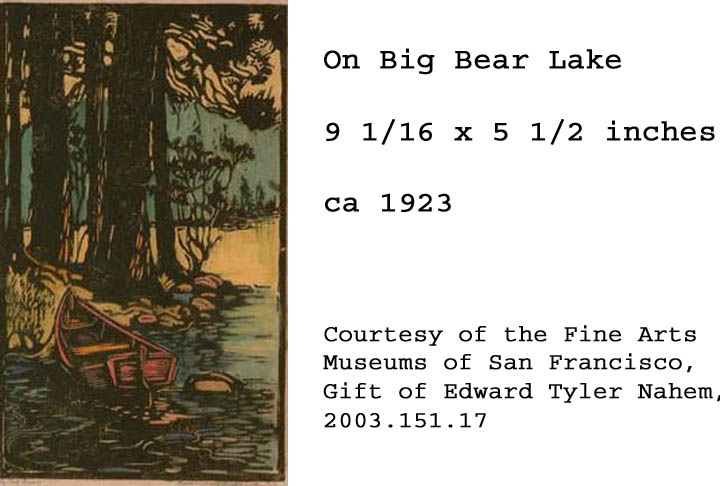
My pencil notes on June 2nd reminded me: Use colors similiar to ones used by Frances Gearhart "On Big Bear Lake"


Here are colors I thought I would use:
black-yellow (green) block
black-white (mid grey) block
yellow-white block
black-white-yellow (olive) block


When I had time to daydream about the design I changed my mind. Perhaps I would use these colors instead: yellow----lt.olive (lit trees)---red brown (pond)---dk green (trees)---lt blue base


Pencil drawings of plants in my neighbor's field gave me plant forms to cut on the linoleum blocks.


I thought I could mix greens using yellow and black, like the days I did when I did the Carrollton mural. But when I mixed both Speedball yellow with black I was disappointed. It produced gray-yellows. The yellow was not as pure as I had hoped. Instead it had a lot of white mixed in to it.


A fellow print
maker gave me an idea. I made thumb-nail smudges of color in a scrapbook, starting with a base Speedball color and adding certain acrylic colors to it. For instance, a yellow Speedball base and an acrylic cerulean blue hue. I took the time, experimented mixing colors, and came up with the charts below. This gave me a ballpark of colors to work from.


In June I finished cutting all the linoleum blocks in the five-block set. Based on my notes I mixed ink and made trial proofs of the linocut (below).


Here are samples of the colors I mixed from that batch. Not all the blocks lined up like I wanted them to.
In July I used ink to make new color schemes (below). I smeared ink on paper. Then, over the course of a couple weeks, I looked at them, thinking, thinking, thinking. At last I picked out the colors I wanted to mix for Afternoon Shade.


This was the scheme I chose. Next I would mix these colors on my brayer palette.


In August I inked and hand-pulled nine individual prints from the five blocks.They would be trial proofs. The nine did not turn out "alike enough" to be an edition.


For alignment purposes the orange block was pushed up from the baseline. (see next photo)

Each time after I inked the yellow portion of the block I placed a paper cutout over it.


The yellow portion and the orange portion were cut on the same block.

They were inked separately. 

The block was washed off after a color was finished being used.


After inking the blue block, a paper cutout mask was placed over it before making a print from it.
 

Click video to see blue block printed. 
Here is what the block print looked like after that. There are nine prints made like this. Some aligned better than others. This was how I find out how to lay the blocks out on the registration board. Through trial and error.

The green block was inked.
 

Click on video to see green block printed.

This was what the four colors looked like.
 

Click on video. Each inked block was washed off in the sink after I was done printing all the prints I was doing for that day. The green block was scrubbed with a brush and tap water. That was what I liked about water soluble ink:)

To make this top color I mixed my blue base with a white base and a dab of Raw Umber acrylic paint from the tube.


Click on video to see ink mixed on brayer palette.
This was the last and top block to be printed on all nine sheets. 

Compare the cut design with pencil drawings above. 

Can you see which plant patterns I cut out? 

Can you see the cow? 

How many cows were in the original design?

Of the nine hand-pulled prints two were selected for my woodcut show at the Lincoln Burkholder Project Gallery. The set of nine was not really an edition.They are not all the same, and so I think of them as monoprints, or one-of-a-kind.
Double click on image to see larger. I love the lighter colors. 

Afternoon Shade measures 4 by 6 inches. It is a color linocut. It is printed on 75 gsm eucalyptus bond paper. It is in a white mat.

Saturday, March 26, 2011

JUMP IN - TRY

Earlier this month I was thinking about the color woodcuts of Frances Gearhart

Double click on images to see enlarged. Just finishing another beveled plywood woodcut (above) with water reflections in the foreground, a shaded bank in the middle, and some foliage over that. Wondering how a solid color could be added behind that image and what that might look like.

Woodblock artist Ansei Uchima described the way he made sure one print was carefully lined up on top of another. His solution was to secure his woodcut block to a printing board "with nails flush against the bottom edge and the corner of the block." There was more to his method, but it dawned on me that printing a second impression on top of the first one would take some thinking and lots of trying. 

This particular post is about not having all your facts together. Sometimes you have to jump into it, and try something, follow your hunch, do it, not know everything, just "try it out." 

The hunch that came to me was to ink the blank side of the plywood plate and print that on several separate sheets of paper. Then, after those were dry, possibly ink the top woodcut, line it up, and print it on top of the solid color background.

One day I had the right kind of energy to do some inking. I set out my long boards for the prints to dry on. I had typing paper to practice on. Some nice brown Kraft paper and some American Masters 90 lb printmaking paper from Utrecht. At the beginning, I drew an outline of the woodcut block on my printing board. I centered a sheet of typing paper on the uninked block, and drew an outline of that sheet on my printing board. Both of these marks served as guides for lining up my prints. One of my goals was to line up prints BY USING MY EYES AND MY HANDS.

This is what a print can look like when the plates do not line up.

Click on the right hand X on the Google ad (when it appears) and it will disappear. This six minute video shows inking solid blocks of color. I am mixing water soluble white acrylic tube paint with water soluble black Speedball ink. You will see the pattern that the burnisher makes on the print when I pull it up. To get an even print one must apply even pressure all over the back on the print. The first print usually has no color, not enough ink reaches the paper, or the ink is not the right consistency. The more I used the Speedball ink, the richer the print looked to me. 

 Here is one try at a solid color block.

 
Another try on Kraft paper. Notice the uneveness of the ink, where I did not burnish the back of the paper. Some print makers might like that particular effect. I was trying for a solid color.

Click on the right hand X on the Google ad (when it appears) and it will disappear. This three minute video continues the process. I am trying to line up a dry print in my hands with a second impression on wet ink. Technically two colors. You notice I am mixing ink as I go. I did not analyze the results until the ink had dried. Merely spreading out prints to dry overnight, and gathering them up the next day. Figuring each step out takes a certain kind of energy. Work at your own pace.

 
An example of two color print or one print on top of another. Double click on image to see color variations.

This is two passes of blue and one upper pass of green. Three impressions in all. Top image was printed on Kraft paper. Bottom image was printed on typing paper. The green swatch would make the top of the water reflection image look more like foliage. In the end it did. So this was a good calculation.

              
Click on the right hand X on the Google ad (when it appears) and it will disappear. This six minute video has me building up the consistency of the ink for the water reflection woodcut. You can see the first "impression" or print is garbled. I am trying to ink it a little bit more each time. The person rolling on the ink controls the amount of ink on the plate.

Notice the little dots on this impression. The paper was not even burnished on the back.  

The same impression was printed twice.

The same impression was printed twice. Blue ink the first pass, black ink the second pass.

                 
Click on the right hand X on the Google ad (when it appears) and it will disappear. In the Block Color 4 video I am ready to print the reflection woodcut on top of colored background.

 One attempt. 
Are the blocks lined up right?

Another attempt.

Another attempt.

                     
Click on the right hand X on the Google ad (when it appears) and it will disappear. One minute video.
Below are Glidden Road and Quarters prints on top of various solid color blocks. 


In the "trying and attempts" there is experimentation, and you find out if your hunches were right or not. Some of the images above are slightly tipped, well, yeh. But I discovered that prints that were created toward the "end of my trying" looked the best. So, lining up prints with EYES AND HANDS can work.

A week later I examined my sixty four dry prints. There were not enough prints that looked so much alike that they could be part of an "edition." Just to illustrate this point take a look at the two prints (above). Double click on images to see the detail. An edition of numbered prints can not and should not have this much difference between the prints. As I am still learning about inking, burnishing, printing...rather than "fidget over what I have printed so far".......I have decided to move on.


Now I am putting ideas down on paper (above) and using a black marker where the darks should be. My interest lies where light regions turn into dark ones. A better place to work out the design is on paper. It is time to put some thought into my next piece.