Our property has a natural waterway along the southern edge. Many tall trees, some with vines, and with some undergrowth. To the west, our lawn touches a pond that runs the length of the Colborn sub- division. As land was sold, houses have popped up around it. It has a shallow depth and in the summertime is completely covered with duckweed. People ask me how the fishing is. I have no idea. I do not fish. And it is not my pond to manage. For which the geese that frequent our property are grateful. The past three weeks a number of geese have bedded down in the shade, nibbing, and pooping, and not being disturbed by outside visitors.
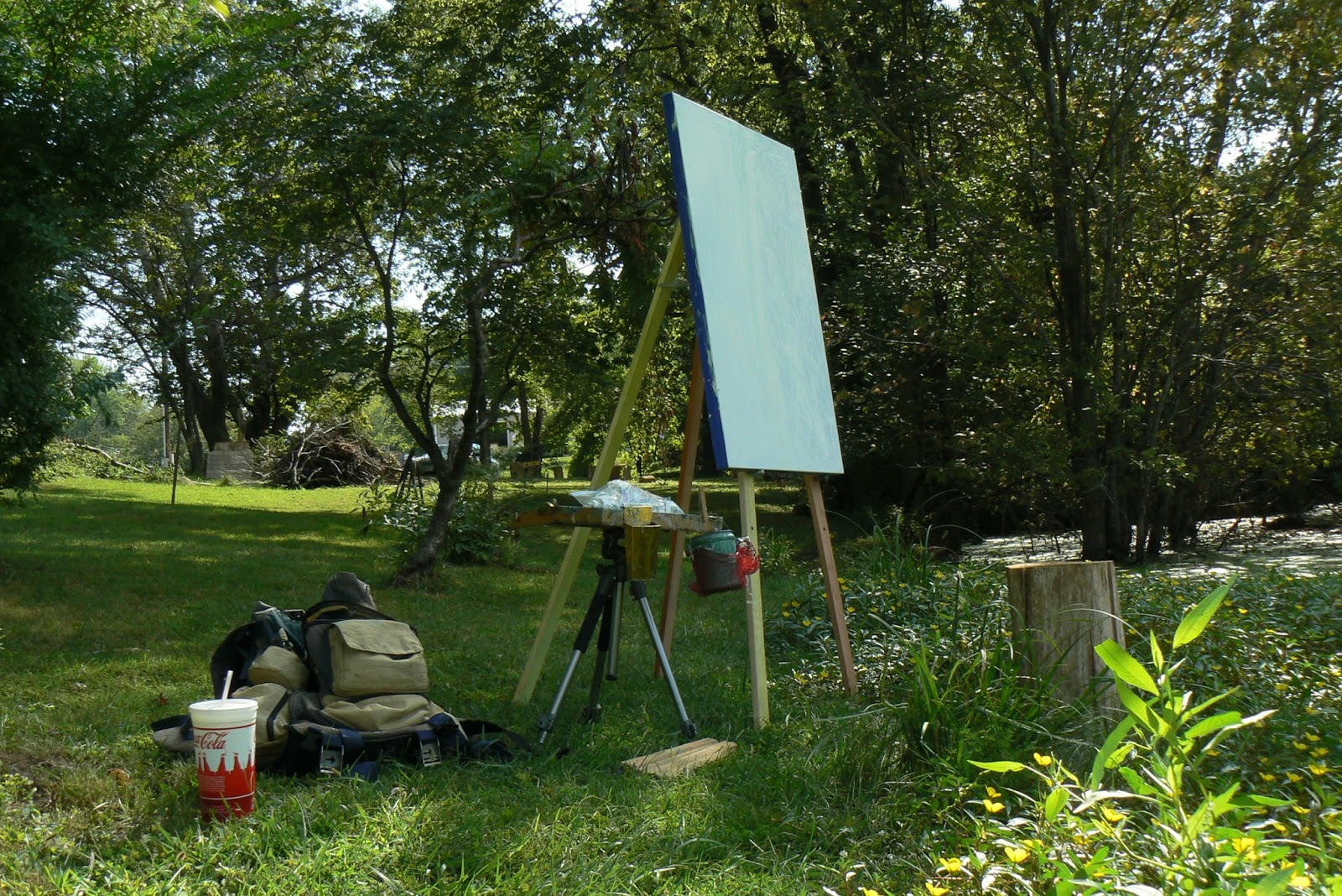
I had scouted a handful of scenes in our yard and placed a wooden stump seat by each. So when Thursday morning came I was ready to begin. Suited up, I carefully carried supplies down to the pond. As always, not knowing what would be accomplished. My main objective was to T-R-Y. As it turned out I spent two mornings on the pond piece. And after lunch and a nap, I worked on a second piece of equal size, at another location on the property. This post covers the progress I made over the mornings of Sept. 3rd and 4th.
A stump to sit on. Supplies ready. Blank canvas measured 30 by 40 inches, edged with blue tape.
The palette started out with Utrecht phthalo blue, titanium white, cadmium orange, and crimson alizarin red. From this I mixed the colors I needed. Later I added Hansa Yellow Pale.
Unpacking tripod and EasyL paint kit and paints.
Video is three minutes.
At 10 am the sun began to peek over the tree tops. That was an element I wanted to keep. (detail)
There were trunks standing in the water. (detail)
A lovely reddish dirt bank curving toward me on the left side.
And a swarm of small yellow pond flowers with orange stems and green leaves at my feet. A simple blue wash for that. (detail)
At 12:30 Thursday midday I stopped as the light had changed significantly.
The next morning (Friday) I got up earlier and began at 7:00 am. I wanted to work on areas in the shade. The surface on the pond was questionable. I liked an sunlight on the left side of the middle trees near the bank, but I did not want scattered sunlight to the right. It was as you see in the above detail, all over the place. It would obscure the elements I wanted to showcase. See next detail. I removed the sunlight patterns my eye was seeing.
Next detail, off to the far left, the lawn grass was as green and
vibrant as ever. Darker colors helped subdue their brilliance.
Where the trees meet the front yard was a problem. I wanted the eyes looking in the backyard, where my design was. So I darkened the edge. Compare next two details, before and after.
Above detail, I brought blues down into the flower area. Dotted yellow, orange green stem swoops, and some greens that I used elsewhere in the painting. That was one reason I got up earlier. To see what the flower patch looked like in the shade. Next detail. Double click to see enlarged.
This photo of the flowers showed its denseness. My version suggests what my eye was seeing. The color decisions are more valuable than the quantity of plants. The kind of yellow, the orange-green swoops, the strong blues, these make the flower area a part of the whole painting. The same colors need to be distributed in brush strokes throughout the painting. That is what gives the whole painting "harmony."
Nine minutes.
and then
and then
and then
The sun peeking over the tree tops was kept. White titanium sunburst. An off-white mixed-blue diffuses off to the left and the right. The way the tops of the tree clusters taper down to the sides and the way the sunburst is central at the top was intentional.
The reddish dirt bank was tricky. The colors on either side of the bank made it too blue or too purpley. It took some doing to make it reddish.
The eye goes to the sun patch and follows the bank on the left side forward to the flower patch. The secondary sun patterns also draw the eye forward to the patch.
Hoping only to work for an hour stretched into two and then three hours. Soon it was 10:00 am and the sun peeked over the tree tops. Now was the time to wrap it up. Keep the elements I wanted.
The surface of the pond to the middle and right needed to be de-emphasized. Made uninteresting. I mixed a blue gray. It wasn't until the next day, and my wife pointed it out, that I realized what that gray shape did to the whole design. It helped create depth. It divided the pond to a far side and a near side. See next detail. It was not my intention, but I am going to keep it for now.
What I have so far, next image. Letting it breathe.
Me getting used to it. Okay with what I have.
This shows the painting on a wall in our house, next.
"Me at the Instruments - Stearing My Underwater Vessel- Complete With Sonar Equipment And Air Tanks" by Karl Marxhausen. Pencil and Wax Crayons on Paper, March 3, 1990, Norwalk, California
Translate
I'LL TELL YOU SOMETHING ABOUT MY HUSBAND KARL.
WHEN HE JOURNALS AND COLORS AND DRAWS ANDWRITES ----- WHEREVER HE IS ------IT TAKES HIM AWAY. IT MEANS SO MUCH TO HIM. REMEMBERING GOD'S PRESENCE.
JAN MARXHAUSEN
Nelson Atkins Print Society Presentation: Intersections With Fred Geary - Karl Marxhausen
THIS IS THE SATISFACTION OF RESEARCH. +++ WHAT THE LORD BRINGS YOUR WAY FOR YOU TO FIND +++ AND THE ENERGY TO PURSUE THE DOORS HE OPENS.+++ BLESSED BY HIS NAME. +++ JOEL MARTY
IT WAS A YELO CAR. A BRIGHT YELO CAR. SEVERAL OF THEM. AS THEY PASSED BY, I COUNTED THEM. THEN AN IMPRESSION CAME - I WAS NOT ALONE. THAT I WOULD FIND MY DESTINATION. AND I DID. BUT IT WAS THE LARGE "K" ON THE SIDE OF THE RED BARN WITH THE WHITE CIRCLE AROUND IT THAT MADE ME CRY. MY FIRST NAME STARTS WITH A "K." AS WE PULLED INTO OHIO THERE WERE THREE OVERPASSES WE DROVE UNDER. NOT A RUSTY BROWN OR DINGY GREY. ALL THREE WERE BRIGHT CANARY "IN-YOUR-FACE" YELLOW!!! THREE IS MY FAVORITE NUMBER. HOW TO EXPLAIN IT. FOR ME, IT WAS A PRESENCE BESIDE ME, REMINDING ME I WAS BEING THOUGHT OF, I WAS NOT ALONE. OFTEN ABSENT FROM MY THINKING, SURPRISES COME. MY ANXIOUSNESS IS TAKEN AWAY. CALM SETTLES IN WHEN HIS KINDNESS COMES. karl marxhausen
"ABOUT YOUR DAD: THE BLESSING THAT CAME INTO HIS LIFE WAS CONCORDIA. THIS SETTING HELPED HIM BECOME THE PERSON HE "BECAME."AND BY SETTING I MEAN THE COLLEGE AND THE CITY OF SEWARD. NO QUESTION ABOUT IT. IT WAS THE PERFECT SPOT FOR HIM."
JACK DUENSING, SEWARD, NE.
Followers
owner of "Sundown" from Seward, NE
Welcome. In retirement my art shows up as words typed on the page. The world of Harry Alfred Fowler fascinates me. My town is a rural farm community. Fowler worked in Kansas City. He brought art folks together. I've been pursuing discovery since 2011. Like Fowler I am gleaning from many sources to share the delightful nuggets that appeal to me. I too have organized, self-published, done art, learned, tried it out. New ground, new discoveries, these fuel my dreams. A book of my own with drawings. In the meantime there are dishes to wash and daily routines to follow. Thanks to friends around the globe who have been a resource to me. History ties a name to a place and a time and then is published and used by the rest.
"SOUNDS LIKE GOD HAS BLESSED YOU WITH YOUR ART. YOU ARE AN INSPIRATION TO MANY!!"SANDY QUICK, KANSAS CITY, MISSOURI
"MAKES PERFECT SENSE TO ME, KARL. I UNDERSTAND THE PRIORITIES OF KIDS. YOUR DAD WAS JUST A "REGULAR DAD" EXCEPT THAT HE TOUCHED A LOT OF PEOPLE'S LIVES, AND THAT MADE HIM EXTRAORDINARY!!!" MATTHEW G. HANSEN, LINCOLN CAPITOL PRESERVATION ARCHITECT
"ALWAYS ENJOY YOUR BLOG, KARL --- YOUR FUN STORIES, CREATIVE WORKS, AND PHILOSOPHIES ON LIFE!! THANKS!" LOIS MEYER VOELTZ
"HOW COOL IS THAT KARL!! CONGRATULATIONS AND KEEP AT IT - YOU ARE DOING WONDERFUL WONDERFUL WORK."RICHARD HAMILTON, KANSAS CITY, MO
"KARL PAINTS WITH STRONG STROKES - SOMETIMES ALMOST SLASHES. HE SAYS IT ALL, FEARLESSLY, IN A FEW WELL CHOSEN WORDS FROM HIS PALETTE. HIS SUBJECTS ARE SIMPLE EVERYDAY THINGS THAT HOLD THE GREAT PLEASURES." PHIL CHADWICK, PAINTER, ONTARIO
"BRAVO KARL. YOUR LANDSCAPES ARE REALLY NICE." ELIZABETH KRUSE, PASTEL ARTIST, MISSOURI
"IT IS GREAT TO SEE THE WONDERFUL ENERGY OF YOUR PLEIN AIR PAINTINGS. I LOVE THE LOOSENESS THAT YOU ARE GETTING AND REALLY FIND EACH ONE A VISUAL TREAT."SUSAN BRASCH, painter,NEBRASKA


No comments:
Post a Comment