January 27th, Friday, after work I practiced lining the sheets up with my registration guides. A blank sheet was repeatedly dropped onto a blank dry linoleum block to get the rhythm, the flow, and to gain personal confidence.
Click to view practice from the top looking down over the guides.
Click to view practice from the table top, looking from the side view.
Next morning, Jan 28, Saturday, the dining room was converted to a work space. Pet food bowls were moved into the living room. The room was blocked off from pets. Tools were set out, ink jars, glass palette, linoleum blocks, etc.

In just over an hour I settled on the base color and began to mix it for the edition. (See next video)

Click video to learn about test strips. Two minutes long.

Close up of small reference study mixed with speedball ink and acrylic paint. I know that "brushwork" and "carved cuts" describe "form" differently. I am interested in achieving some of the same color and pattern (ABOVE) in my finished linocut reduction.
After three steady hours-- the fifteen 12 x 10 inch sheets were printed and hung up to dry. In addition, ten of the 18 x 15 sheets were also printed. As this project moved forward I decided to ink the small 6 x 4 inch block and the large 12 x 9 inch block with the same ink colors. The designs of each were slightly different. Upon completion my lower back was tight and sore. The linoleum blocks were scrubbed free of ink, the area straightened up, and print supplies put away. The pets regained use of the dining room.
Click video to see mixing ink, rolling on brayer on the block, and hand burnishing of sheet on linoleum block. Four and a half minutes long. Each impression was made in this manner.
February 11th, Saturday morning, the work area was set up.
After four steady hours the remaining thirty 18 x 15 sheets received their base color and were dried on the clothesline above my head. That was quite a stretch. Sore muscles aplenty. I had used 8 ounces of white ink for that session alone.

Next, both uncut blocks were painted blue. The 4 x 6 inch (ABOVE) and the 9 x 12 inch (BELOW). Next time I cut them, the cuts would stand out in contrast to the blue color.

Click to view practice from the top looking down over the guides.
Click to view practice from the table top, looking from the side view.
Next morning, Jan 28, Saturday, the dining room was converted to a work space. Pet food bowls were moved into the living room. The room was blocked off from pets. Tools were set out, ink jars, glass palette, linoleum blocks, etc.

In just over an hour I settled on the base color and began to mix it for the edition. (See next video)
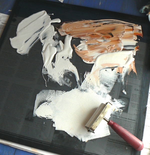
Click video to learn about test strips. Two minutes long.
"The base color that I am using for my linocut project is burnt sienna mixed with lots of white speedball water soluble ink. When I first started I made a 24 by 18 inch acrylic painting on paper. Next, I did a smaller study mixing all my colors from speedball blue and white INK plus the burnt sienna ACRYLIC. So, now I am trying to mix ink to match this color here (of the lighter sky). Here are my test strips. This first strip is much too dark when laid next to the painting. My next ink batch looked like this. It is lighter but not light enough. Here is another test strip. Then I made more test strips. One of the things I noticed, when I print on the paper here, is that right before the ink is completely dry it looks much darker than it really is. At first I panicked. When it is completely dry it does dry lighter. It looks more like this cream one here. The color is faint and it will look real nice. Compared to the study, see how light that is? So, this is my base color that I am putting down, and this is the linoleum block that I have been using, and here is where I mix the ink on the glass palette."

Close up of small reference study mixed with speedball ink and acrylic paint. I know that "brushwork" and "carved cuts" describe "form" differently. I am interested in achieving some of the same color and pattern (ABOVE) in my finished linocut reduction.
After three steady hours-- the fifteen 12 x 10 inch sheets were printed and hung up to dry. In addition, ten of the 18 x 15 sheets were also printed. As this project moved forward I decided to ink the small 6 x 4 inch block and the large 12 x 9 inch block with the same ink colors. The designs of each were slightly different. Upon completion my lower back was tight and sore. The linoleum blocks were scrubbed free of ink, the area straightened up, and print supplies put away. The pets regained use of the dining room.
February 11th, Saturday morning, the work area was set up.
After four steady hours the remaining thirty 18 x 15 sheets received their base color and were dried on the clothesline above my head. That was quite a stretch. Sore muscles aplenty. I had used 8 ounces of white ink for that session alone.
Next, both uncut blocks were painted blue. The 4 x 6 inch (ABOVE) and the 9 x 12 inch (BELOW). Next time I cut them, the cuts would stand out in contrast to the blue color.

The glass palette was cleaned up with the water pump, a razor scraper, paper towels, and patience.
After tools were stored, I downloaded camera shots onto my work computer. By 4:20 pm I was done for the day.


No comments:
Post a Comment